Our Logo Story
Our Church logo launched at the end of March 2021 along with this version of our Church website. The Outreach Committee and Session reviewed and approved the new logo. The cost of the logo design was covered by a Transformational Grant from the San Fernando Presbytery.
The logo package comes with various sizes and colors of the logo and icons as well as its own color palette. Many of the colors are shown on this page. Any and all who are interested in using the logo and icons should do so through the Outreach Committee, please contact us here.

The Full Logo
The Icon

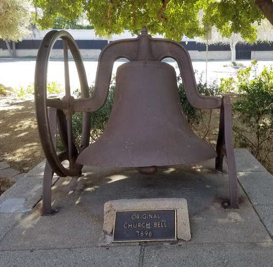
The Bell


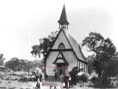
As the graphic designer, John Irwin, describes, “The focus of the logo symbolism is on the historic heritage of the church and our Christian faith. The logo icon begins rooted in the open Bible at the bottom, illuminating the path through the landscape of rolling hills (signifying the original landscape of the Santa Clarita Valley). The original bell of the church lies at the center of the logo. The cross on top of the bell acts a reminder to keep our eyes toward Christ. The logo icon is capped with a rainbow signifying God’s promise and our Church’s commitment to progressive ideals. The logo icon is paired with a bold, sans-serif type treatment so that the text is clear from a distance and is great for readability.”

The original Church bell dates back to 1896 and is still on our property.

All images from Chaplin films made from 1918 onwards,
copyright © Roy Export Company Establishment.
